

CLIENT:
Village Hoboken (Viola)
INDUSTRY:
Cannabis/Retail
OBJECTIVE:
Design employee apparel that reflects Village Hoboken's brand identity, community-rooted, approachable, and just a little playful; while being something the staff would actually be proud to wear.
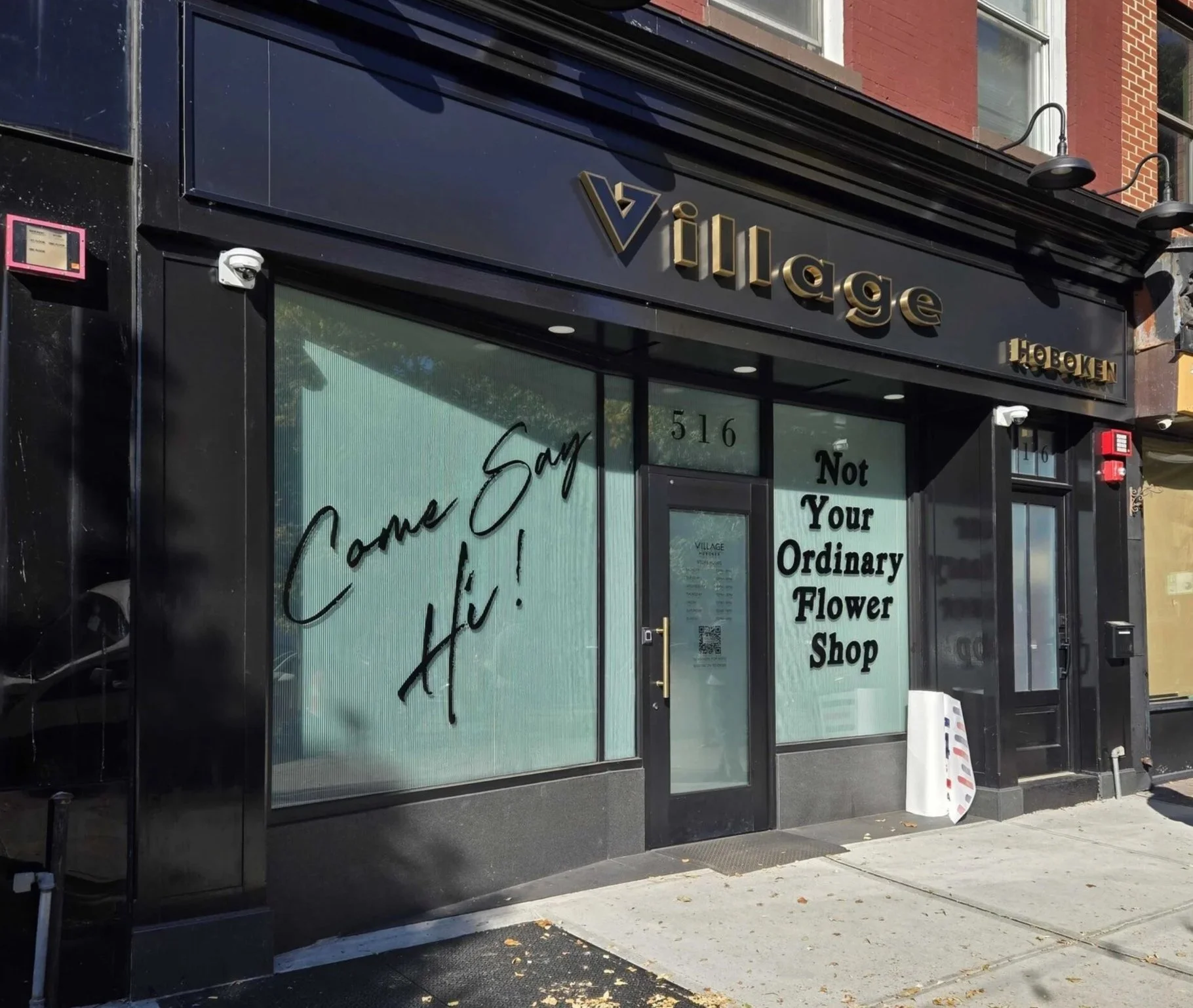
VILLAGE HOBOKEN
Village Hoboken isn't just a dispensary. It's a neighborhood spot built around the idea of a flower shop; warm, local, and a little unexpected. That personality needed to come through in every design decision, from the tagline to the colors. The concept "Not Your Ordinary Flower Shop" became the heart of the apparel. It's a line that works on multiple levels: a nod to the dispensary's floral concept, a wink to what's actually being sold, and a genuine invitation to the Hoboken community to come check it out.
VISUAL DIRECTION
Color: Purple, green, and off-white, pulled directly from Village's core palette to keep the apparel instantly recognizable as part of the brand.
Typography: A mix of clean serif and hand-drawn lettering created a balance between polished and personable. Professional enough for a staff uniform, warm enough for a community space.
Tone: Playful, local, approachable. The shirts needed to feel like the store itself.
DESIGN PROCESS: EXPLORING CONCEPTS


I explored a range of concepts before landing on two final directions, both anchored by the brand's floral identity and New Jersey roots.
Several typography styles were tested; from traditional florist serifs to more expressive, hand-sketched treatments to find the right balance between readability and character. Early mockups were evaluated across different shirt colors and styles, with feedback guiding the final decisions toward simplicity and impact.

FINALIZED DESIGNS AND APPAREL OVERVIEW:


Design 1: “A New Meaning to the Garden State”
Front: Village Staff logo on the left chest.
Back: A map of New Jersey with the slogan in playful hand-drawn lettering.
Colors: Black base with green and purple graphics that tie back to the brand palette.
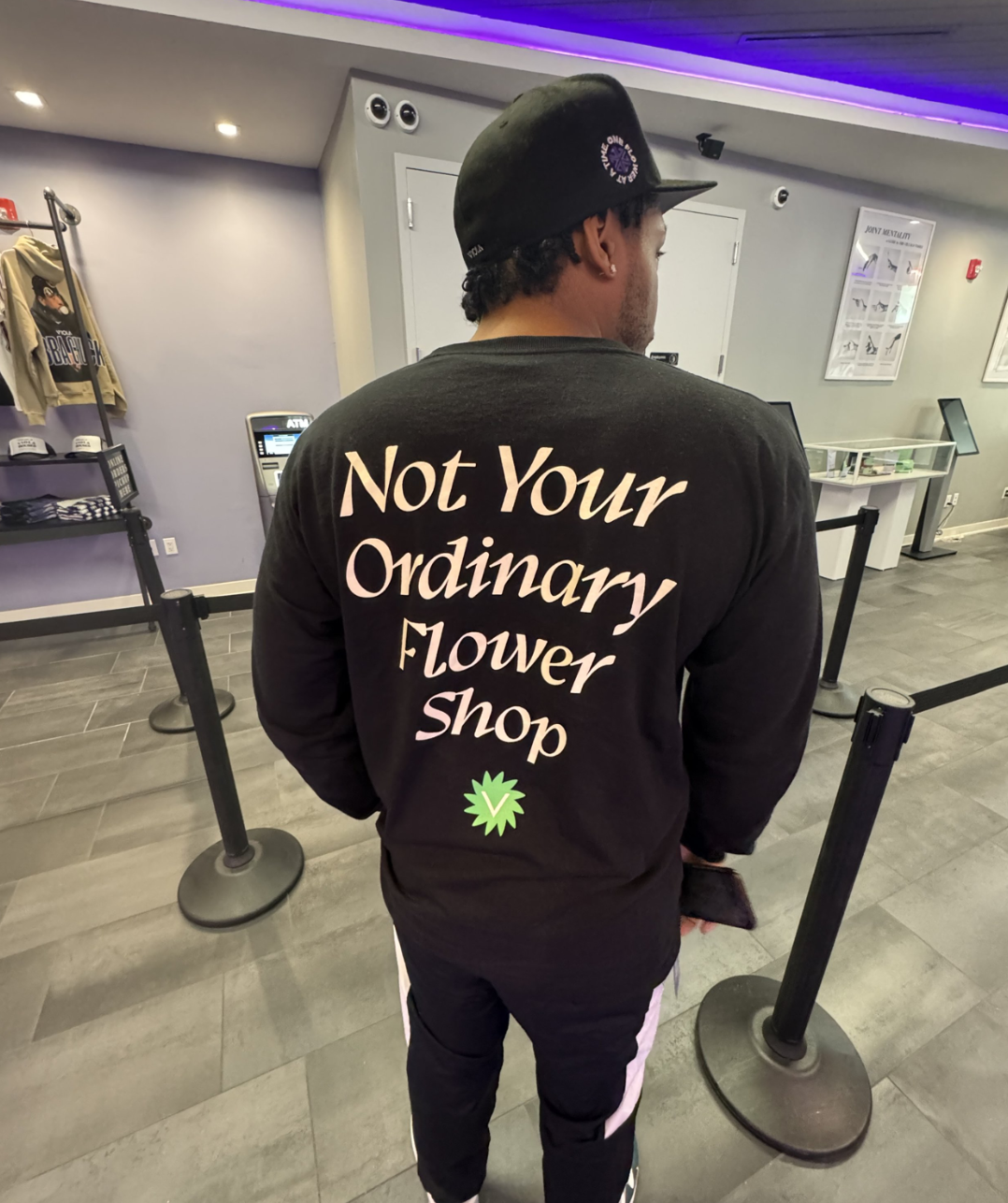
The Village Hoboken staff t-shirts successfully embody the spirit of the dispensary through thoughtful design choices. These shirts communicate the dispensary’s playful yet professional nature while fostering a connection to the local community. By balancing aesthetics with practicality, I delivered apparel that employees are proud to wear and customers find engaging. This design project exemplifies how strategic visual identity, combined with a clever messaging strategy, can reinforce a brand’s core values while engaging both employees and the community.
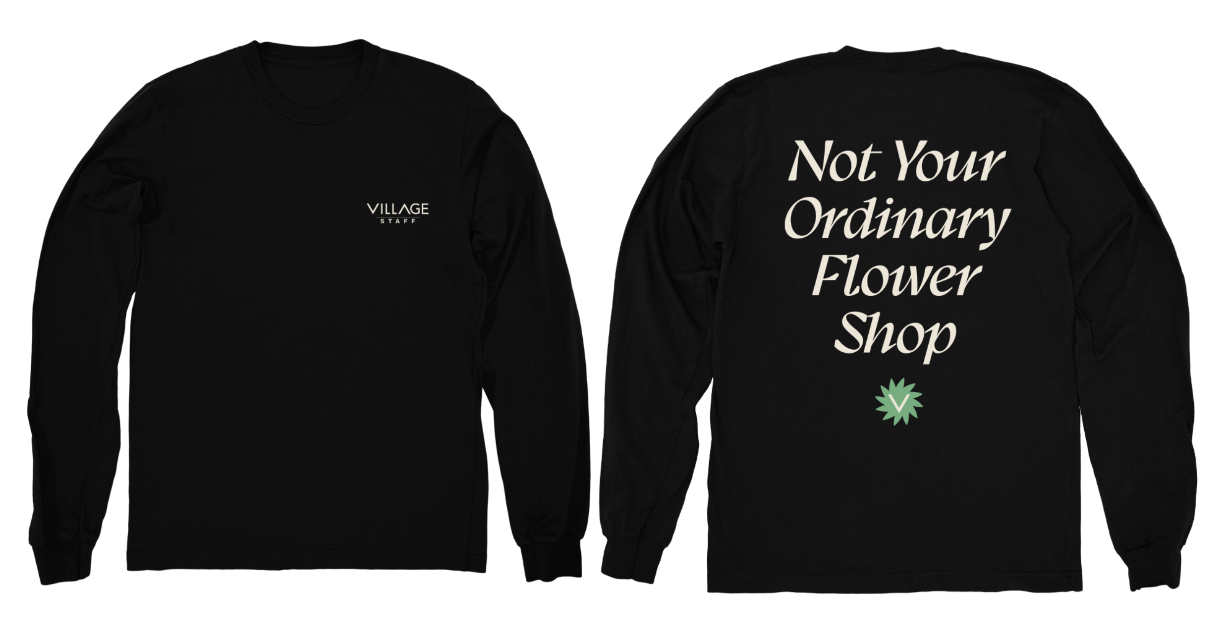
Design 2: “Not Your Ordinary Flower Shop”
Front: Village Staff logo on the left chest.
Back: The tagline in a clean serif font, paired with a subtle flower motif.
Colors: Black with off-white text and a green floral graphic, simple, sharp, and memorable.