
PROJECT:
Brand Identity Design for Hertz Labs
GOAL:
Establish a cohesive visual identity for a premium co-working and studio space catering to music producers, audio engineers, and multimedia artists.
OBJECTIVE:
Defined by an AI-generated prompt, the objective was to create branding for a space that prioritizes collaboration, acoustic excellence, and a cutting-edge environment. The logo needed a visual language that conveyed creative energy, shared space, and auditory precision. Illustrating how a designer can effectively collaborate with AI as a partner rather than a replacement to expedite the creation of professional-grade branding.
THE DESIGN PROCESS
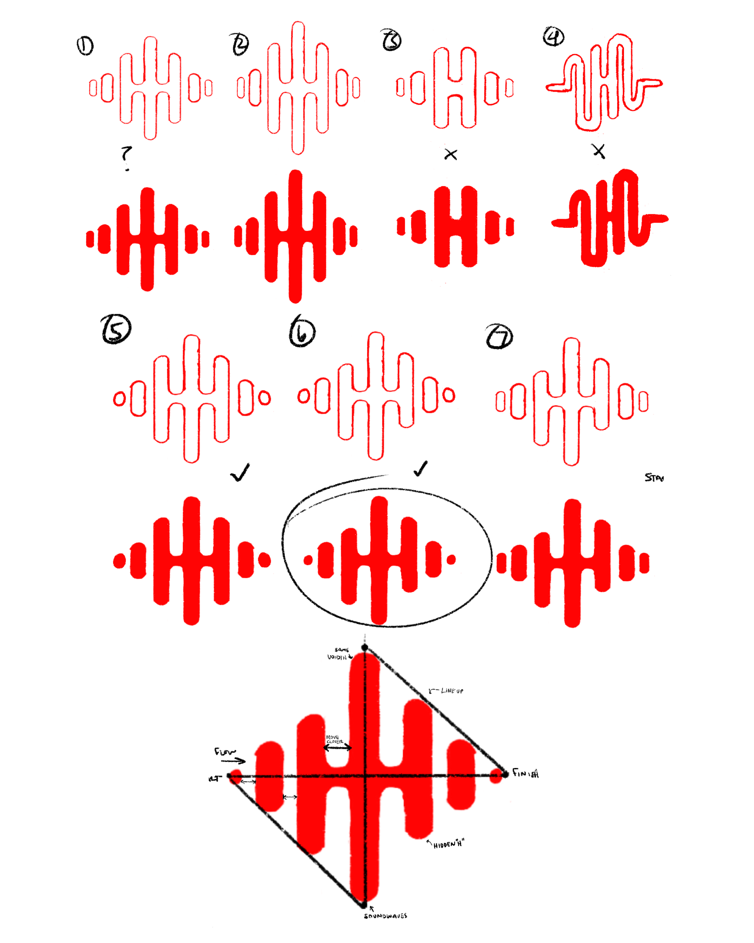
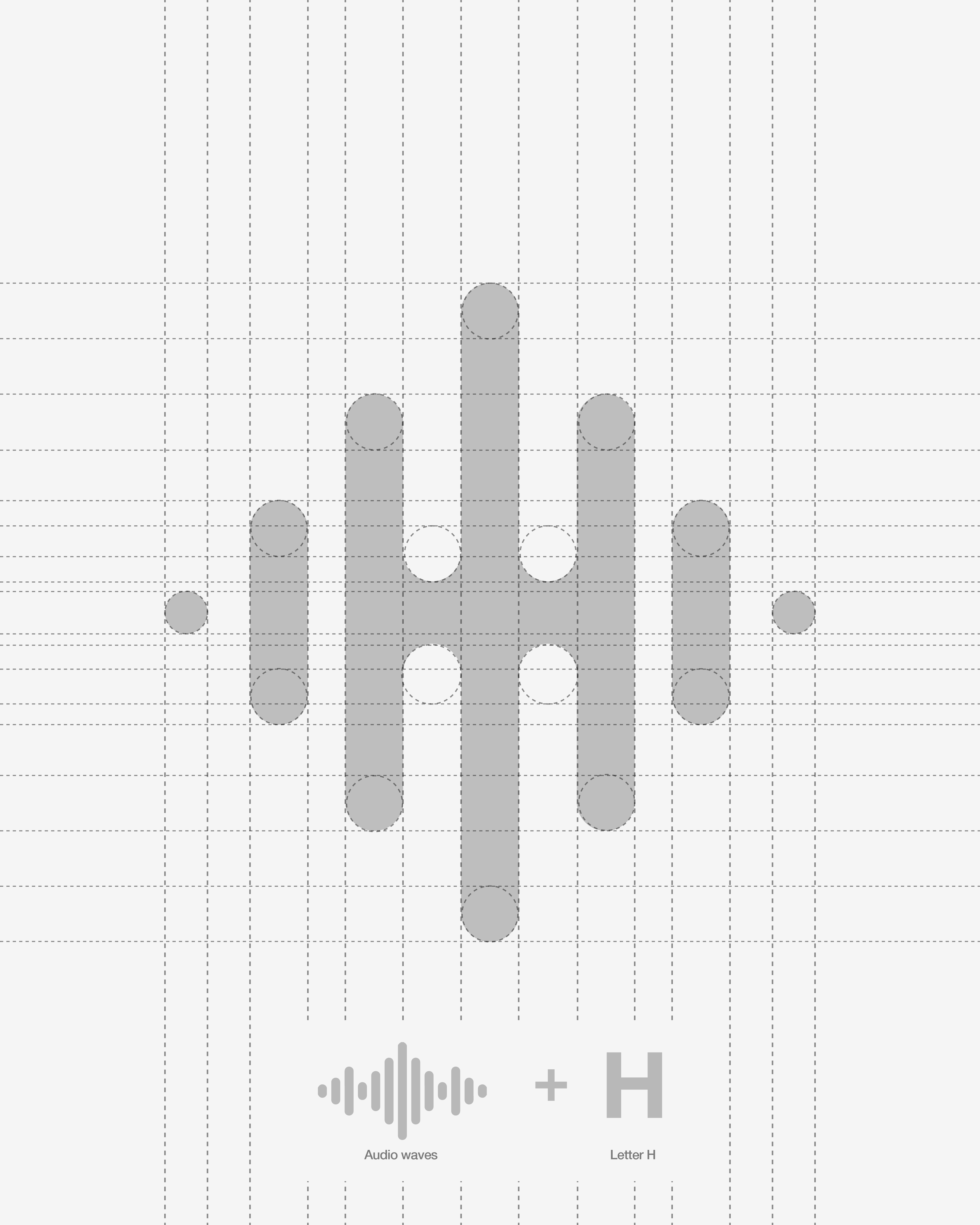
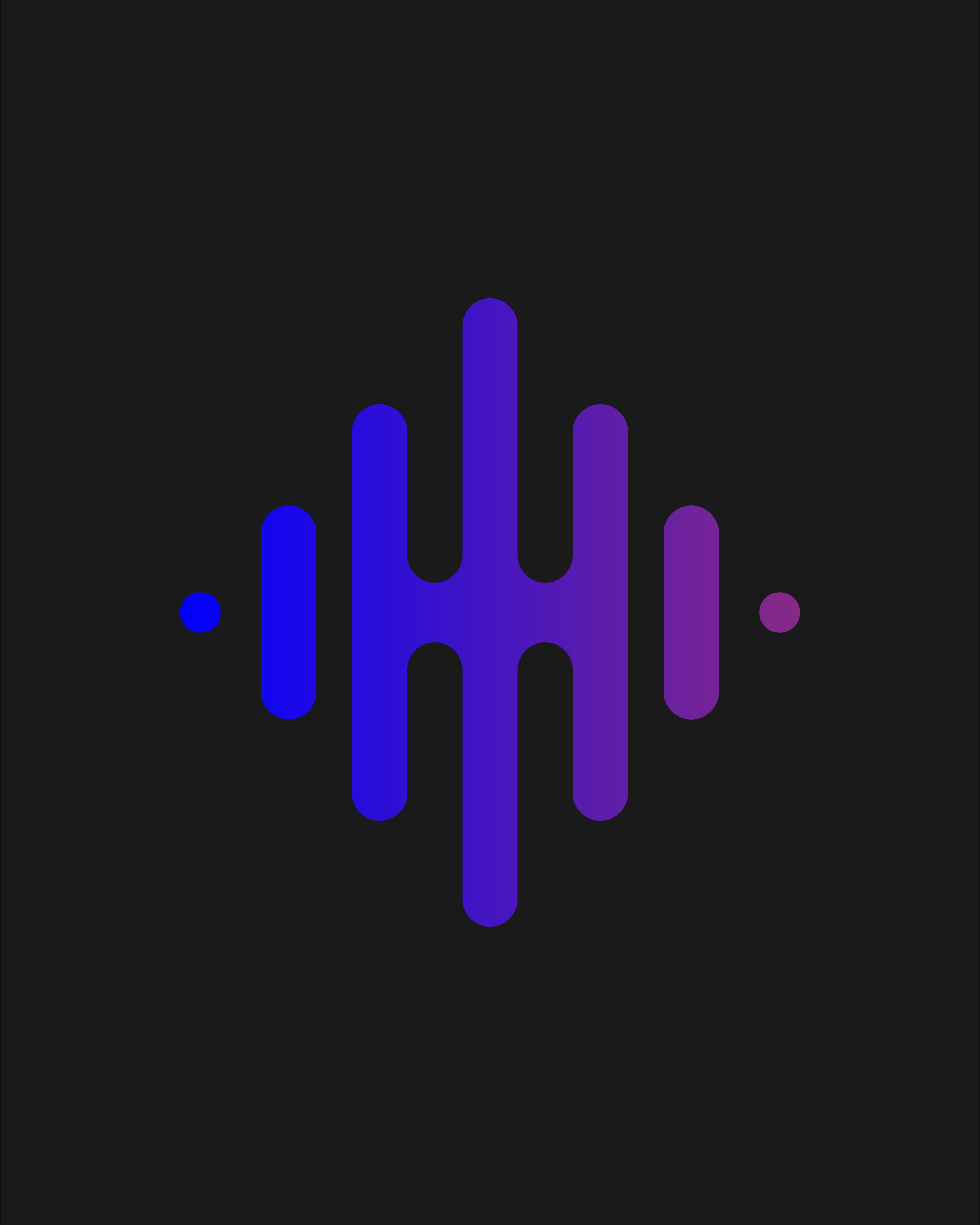
Finding the Mark: I started with the obvious; sound waves, frequency bars, waveforms. Most of them looked like every other audio brand. The breakthrough came when I stopped looking at the shapes as decorative elements and started treating them as structure. The frequency bars, when properly spaced and weighted, naturally form an "H." That hidden letterform became the foundation of the entire system.
Locking it into a grid: Once the concept clicked, precision became the priority. Audio engineering is a discipline built on exactness, the brand had to reflect that. I refined the wave construction so the negative space within the mark mirrors the letterform cleanly at any scale. Every curve, every gap, every weight relationship follows a geometric rule.
THE VISUAL IDENTITY: LOGO SYSTEM
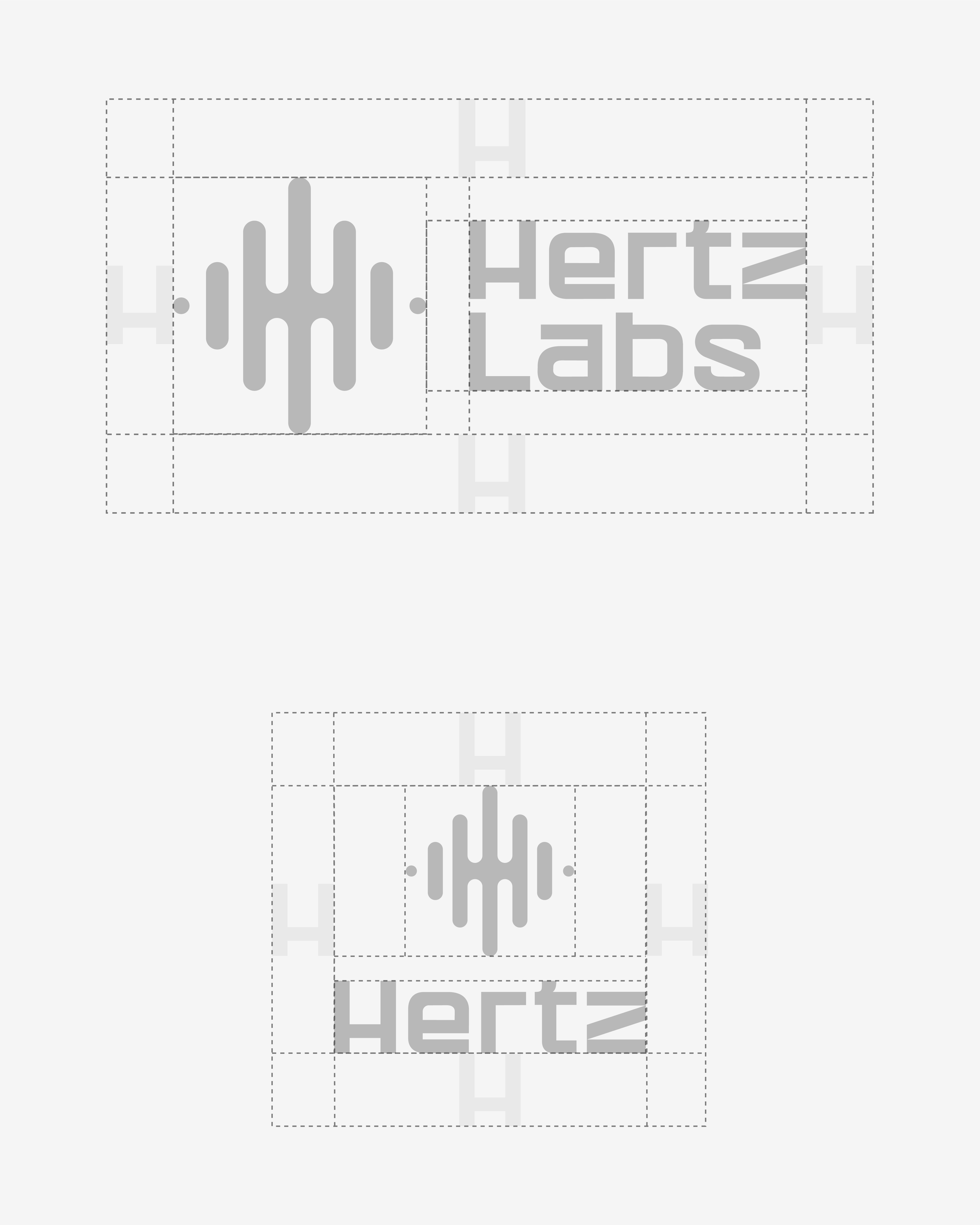
The Hertz Labs identity is built as a modular system, not a single static file. Every configuration was designed to maintain its integrity across scale, surface, and application.
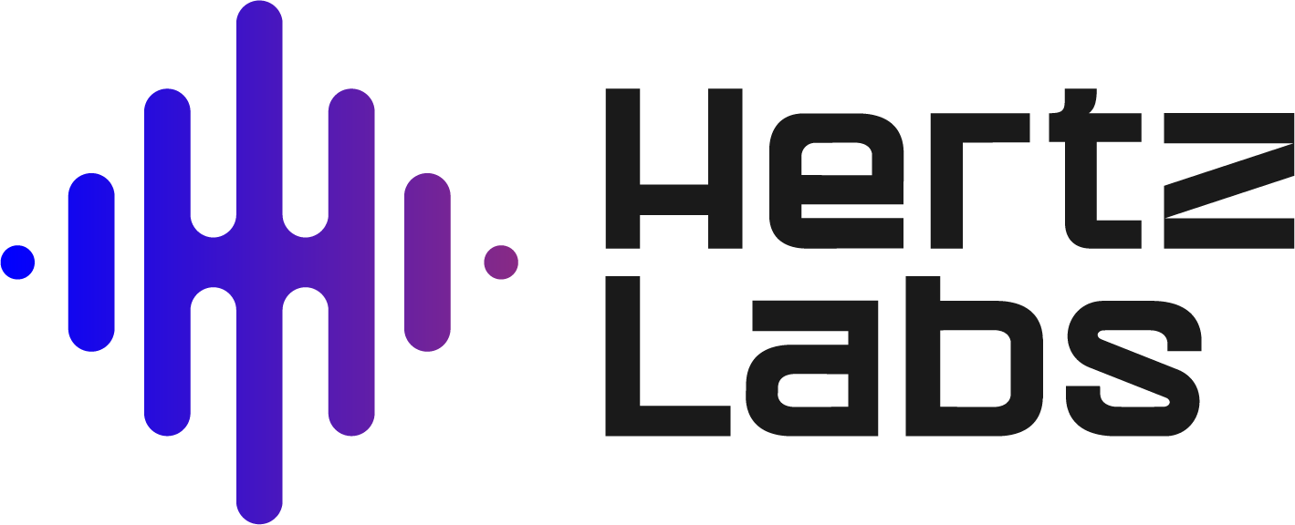
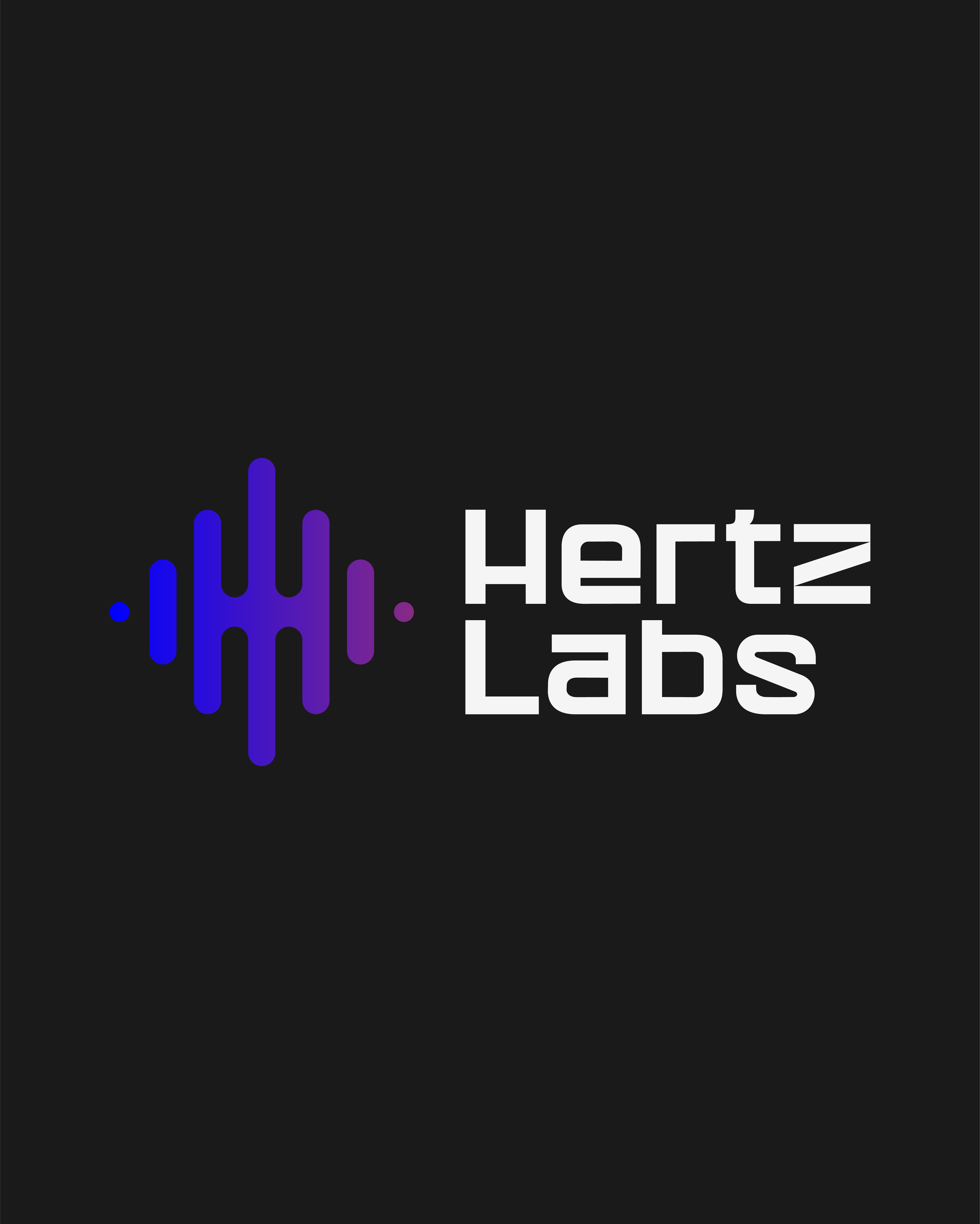
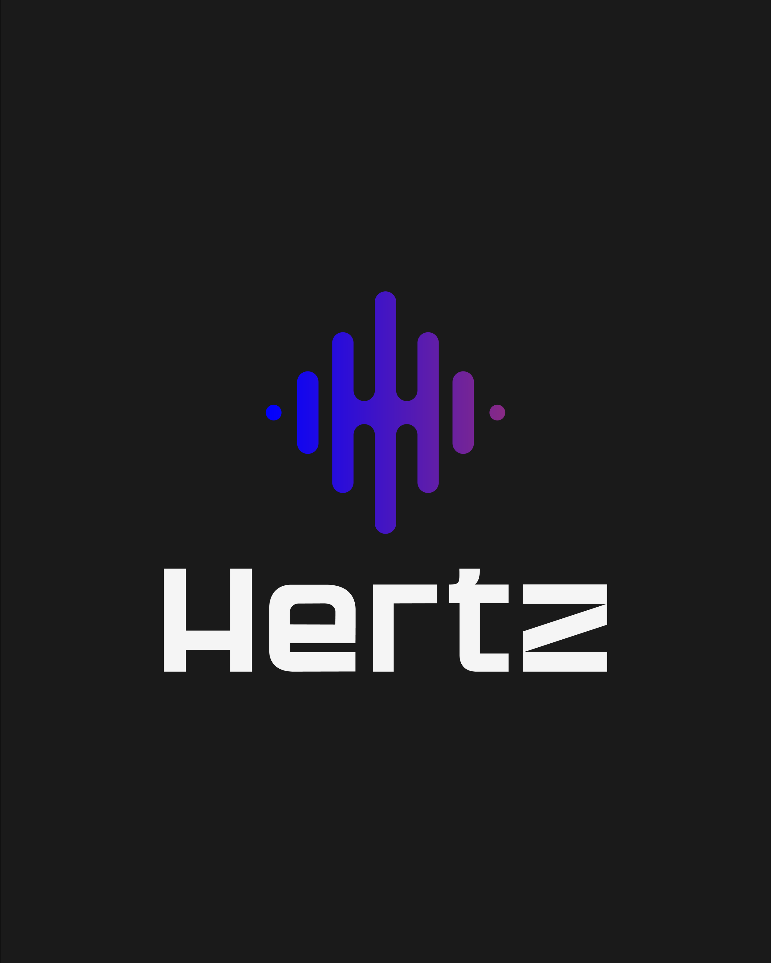
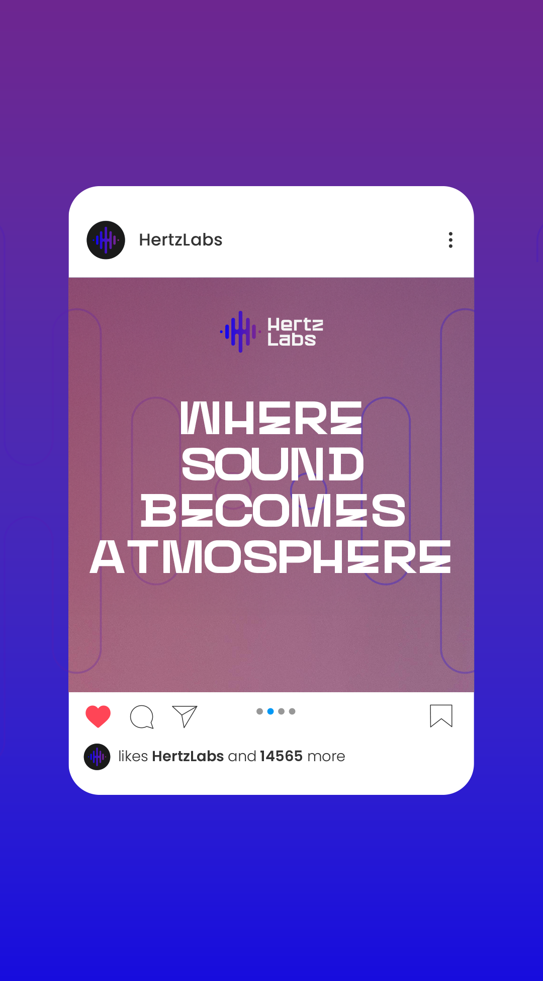
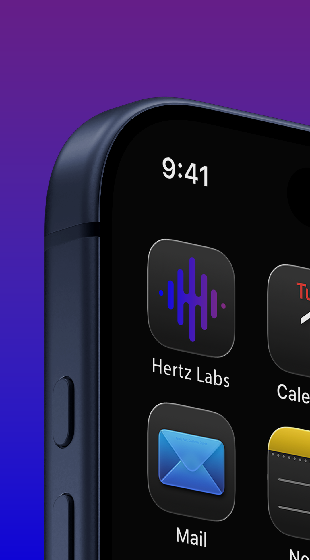
The Icon Mark (The Pulse): The standalone signature of the brand. The frequency-wave "H" carries the full weight of the identity without the wordmark; clean enough to be etched into glass, bold enough to anchor a wall, precise enough to function as an app icon.
The Vertical Lockup: Built for architectural scale and high-profile placement. When the brand needs to own the room. Signage, printed collateral, large-format applications; this configuration commands attention without losing structure.
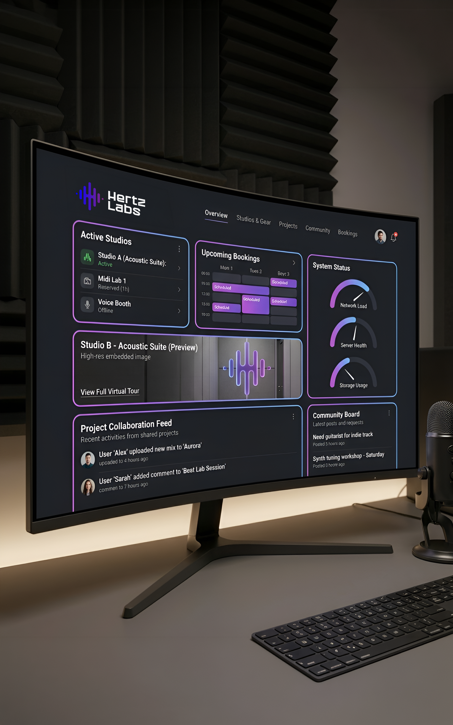
The Horizontal Lockup: The everyday workhorse of the system. Optimized for digital interfaces, website headers, and horizontal signage where space is at a premium. It maintains legibility and geometric balance regardless of the canvas.
SYSTEMIZATION & CONTEXT
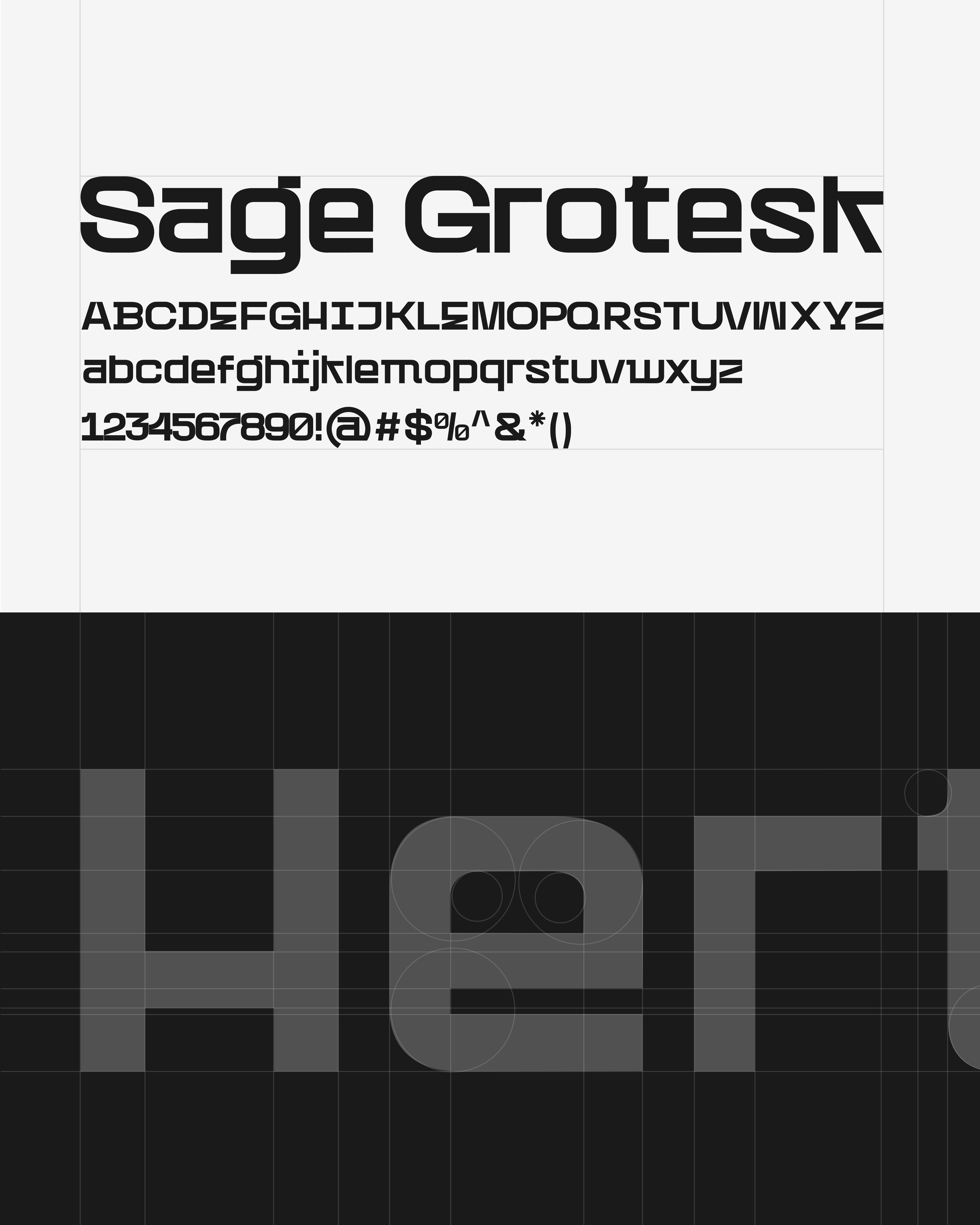
Typography & Visual Voice: Sage Grotesk was the right call for one reason, its geometry matches the logo's geometry. Wide set, squared counters, heavy presence. It doesn't fight the mark, it extends it. The result is a brand voice that reads as technical and professional whether it's on a small app icon or a large studio wall.
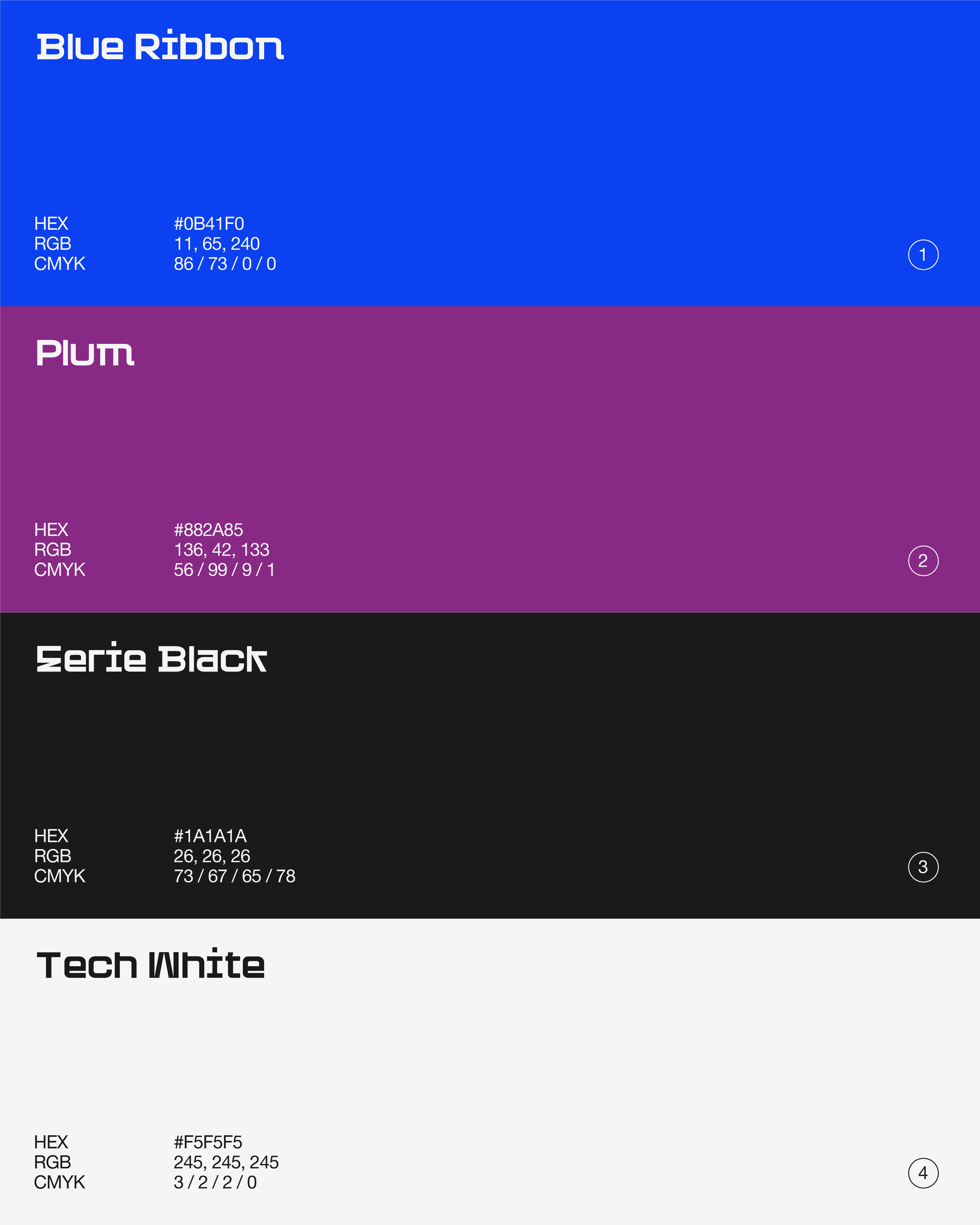
Color Psychology & Atmosphere: The palette was engineered around the studio environment itself.
Blue Ribbon & Plum: Pull from the glow of a DAW at 2am, the energy of creative output in motion.
Eerie Black & Tech White: The neutral anchors. They give the brand its premium contrast and keep it grounded without competing with the mark.
Systematization & Scalability: This phase was about building the rules of use, the standards that protect the brand when it leaves the designer's hands.
Logo Lockups: Clear relationships between the mark and the wordmark across all configurations.
Clear Space: Defined protection zones that keep the logo legible and prominent in any context.
By grounding the system in typography, color, and usage rules, the project moved past concept into something a real organization could actually deploy; a scalable brand, not just a polished presentation.
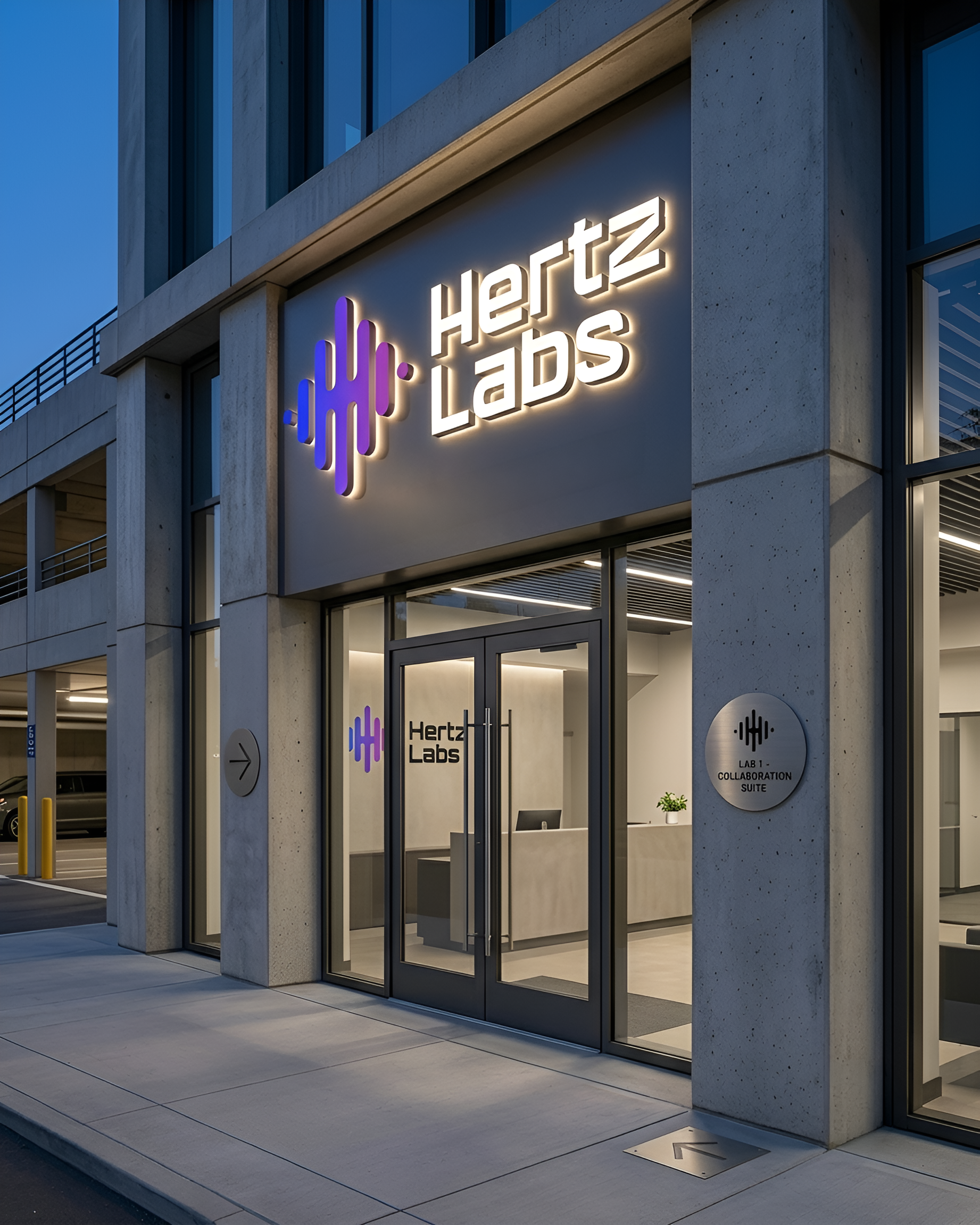
REAL WORLD BRAND APPLICATION
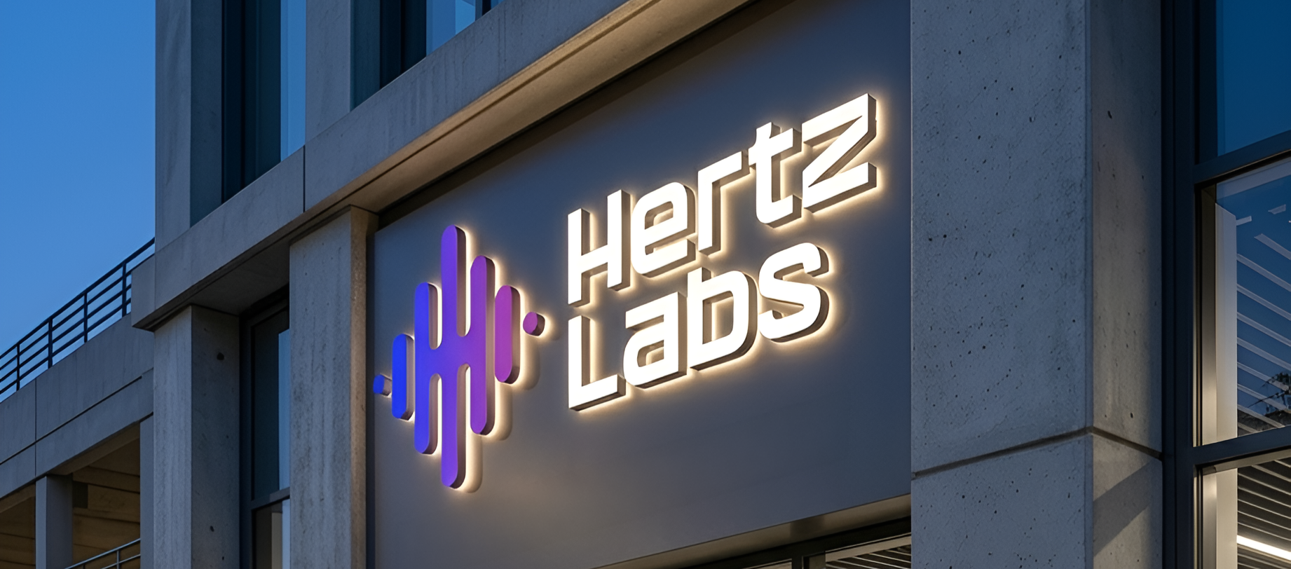
The true test of any brand identity is its ability to transition from a two-dimensional vector file on a screen, into a three-dimensional immersive environment. For Hertz Labs, the brand system was engineered to scale seamlessly across physical and digital touch points, ensuring consistency at every interaction.
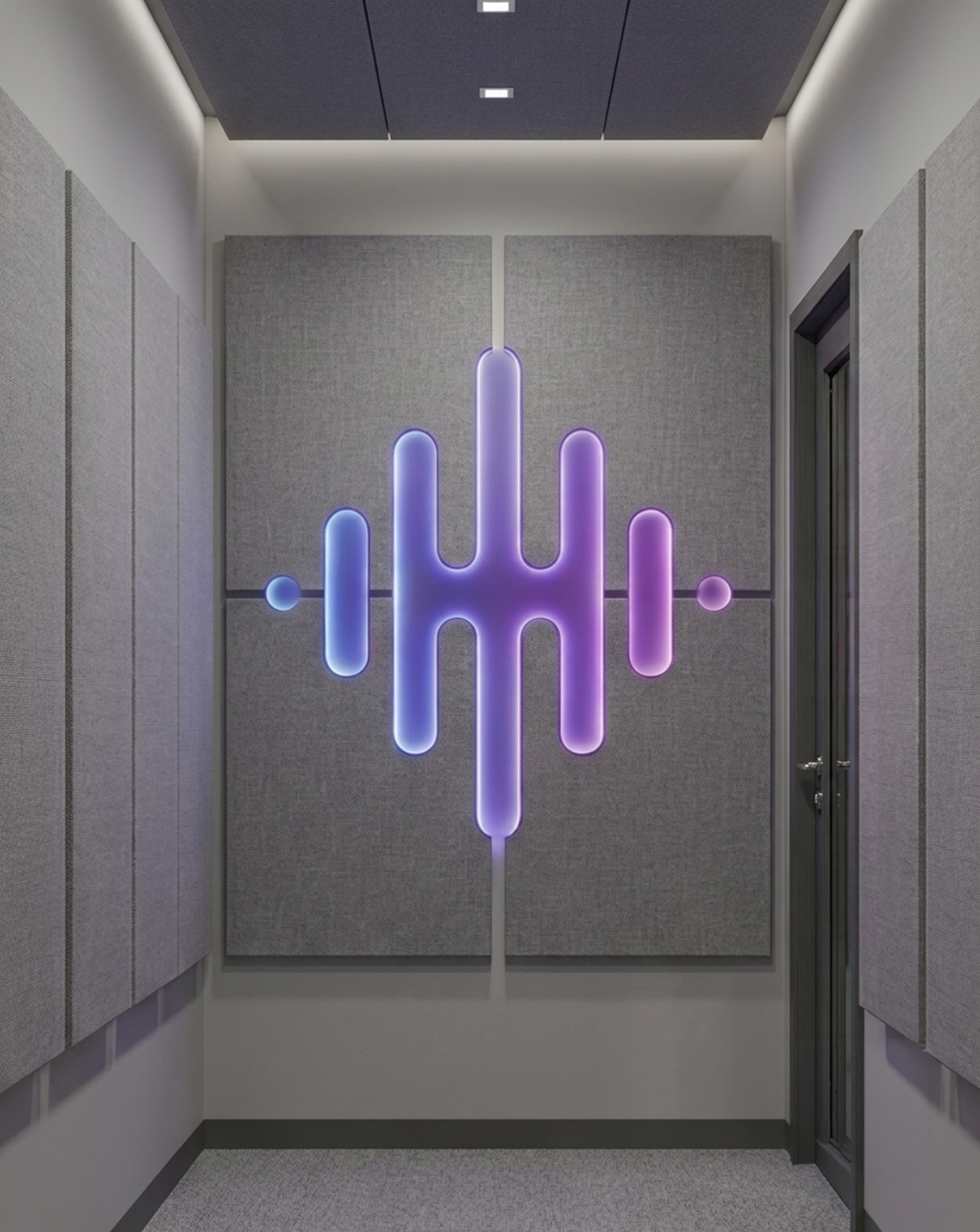
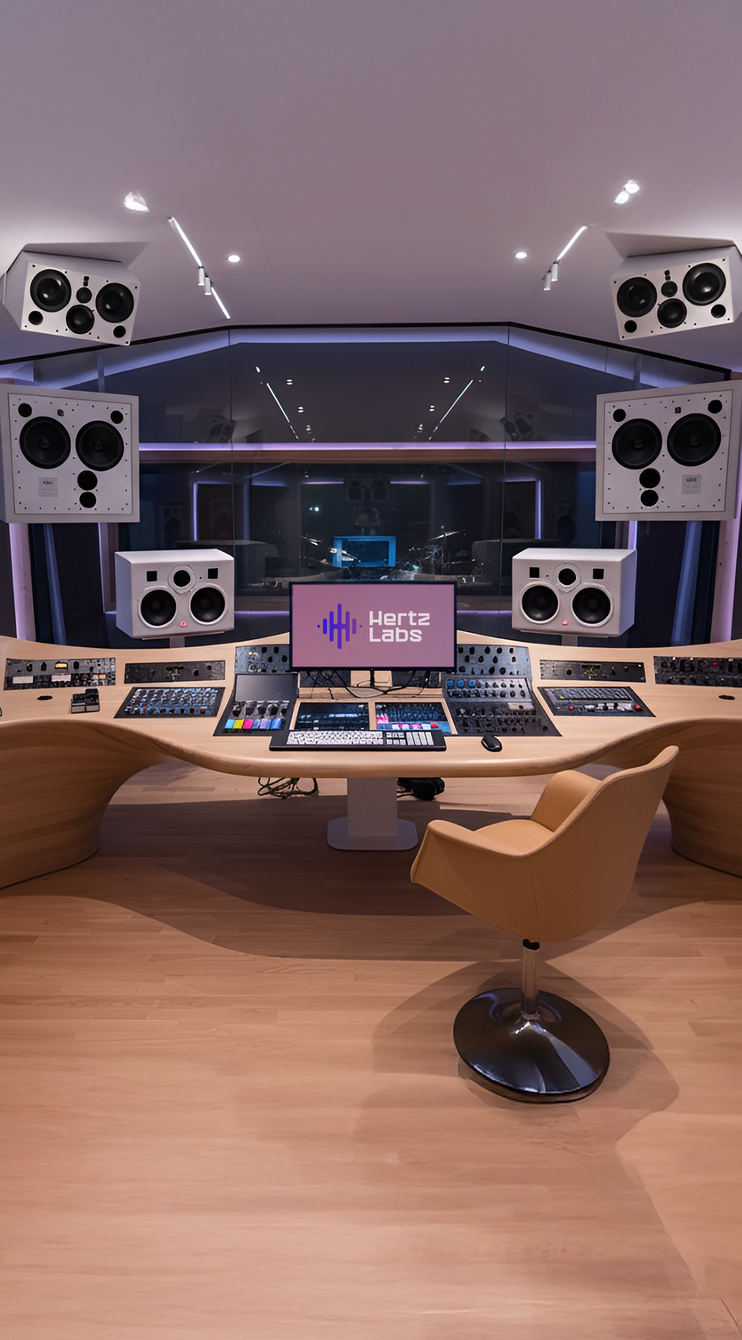
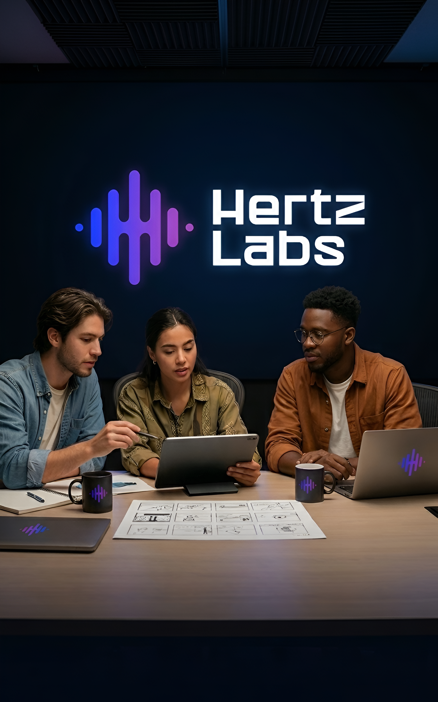
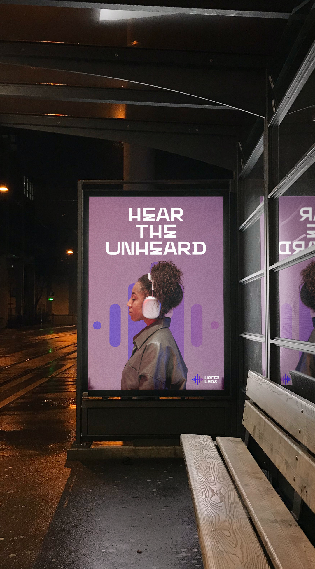
Creating a Spatial Language: A high-end studio is more than equipment, it's an environment. Extending the Hertz Labs visual language into the physical space transforms the identity from an abstract mark into a foundational element of the facility itself. Every room, every surface, every detail signals that this place was built intentionally.
Building a Unified Ecosystem: The goal across every touchpoint (signage, physical collateral, digital interfaces) was to create a seamless experience. When a member walks through the door or opens the app, the visual language stays constant. That consistency builds trust and signals professional authority before a single word is spoken.
The Power of Consistency: Consistency is what separates a logo from a brand. By maintaining strict control over color, scale, and typography across every medium, the identity stays recognizable regardless of where it shows up. The visual energy of the mark amplifies the studio's atmosphere rather than just decorating it.
"A brand isn't just what you see on a screen. It's what someone feels when they walk into the space for the first time. That's what you're designing for."

ANALYSIS OF AI-HUMAN COLLABORATION
This project was a proof-of-concept for the future of the design industry and how designers should be thinking about AI right now.
AI's Role: Generated the initial brief, helped visualize spatial placement, and accelerated mockup testing; removing friction from the process without driving any of the decisions.
The Human Designer's Role: Everything that made the brand actually work was a human call. The hidden H, the typeface selection, the color logic, the strategic refinement of the frequency waves; none of that came from a prompt. It came from a designer who knew what problem needed solving.
"AI is far from perfect, and as a designer, I'm not worried about it replacing me. What will replace you is a designer who knows how to collaborate with AI to get the job done."
CONCLUSION
The Hertz Labs identity proves that efficiency and depth aren't in conflict, not when the process is right. By using AI to accelerate execution, I was able to spend more time on the strategic decisions that actually shape a brand: the concept, the system, the intent behind every choice. The result is an identity that feels custom, intentional, and built to last; because it was designed that way, regardless of how fast it came together.